| Mr Paint
If you own a period home in Cheltenham, you’ll know these houses come with more than just bricks and mortar—they carry history, charm and architectural detail that deserves to be celebrated. From Regency terraces with ornate plasterwork to Victorian villas with bold proportions, the paint colours you choose can make all the difference. Get it right, and you’ll enhance the beauty of your home for years to come. Get it wrong, and the magic of your period property can be lost under the wrong shade of magnolia.
In this guide, I’ll walk you through the best paint colours for Cheltenham’s Regency, Victorian and Edwardian homes. Along the way, I’ll share professional insights into lighting, finishes and practical application. Whether you’re considering a bold statement on a staircase or a soft, heritage-inspired neutral for your walls and ceilings, this article will help you choose with confidence.
Why paint colours matter in period homes
Period houses aren’t like modern new-builds. They have high ceilings, alcoves, fireplaces, and staircases that were designed to impress. Colours don’t just decorate these spaces—they shape how the architectural features are experienced. The wrong shade can feel flat, while the right one can bring out mouldings, woodwork and stonework in the most flattering way.
Cheltenham has a particularly rich architectural heritage. Known for its Regency crescents, leafy Victorian streets, and spacious Edwardian houses, each style has its own colour story. Choosing your palette is about finding harmony between history, light, and your own modern taste.
Regency interiors: light, airy elegance
Regency homes are known for their refined elegance. With tall sash windows and decorative cornices, these spaces thrive on light, soft colours that highlight detail without overwhelming it. Gentle chalk whites, warm greys and pale blue-greens are timeless choices.
Recommended colours
- Soft chalk whites with a warm undertone
- Pale grey-greens that complement Cotswold stone
- Delicate blues that lift natural light
For trims and woodwork, avoid harsh black or brilliant white. Instead, look to softer contrasts: deep indigos or charcoals, paired with a warm neutral on walls, can make fireplaces and doors stand out with sophistication.
For inspiration, brands such as Farrow & Ball and Little Greene offer beautiful Regency palettes rooted in historical accuracy.
Victorian homes: depth, drama and richness
Victorian interiors embraced boldness. Dark dining rooms, rich libraries and patterned tiled hallways were the order of the day. This is where deep tones really come into their own.
Recommended colours
- Oxblood reds for dining rooms and snugs
- Deep navies or bottle greens for libraries and hallways
- Earthy browns and olives for balance
The Victorians loved contrast, so don’t be afraid of darker trims against slightly lighter walls. That said, if you’d like a more modern twist, you can temper strong colours with warm greys on ceilings or lighter tones on woodwork. The key is to ensure that staircases and banisters don’t get lost—these deserve special attention.
If your hallway has decorative tiles, choose wall colours that echo their warmer undertones. This creates cohesion and avoids the clashing effect of cooler greys.
Edwardian houses: calm, crafted style
Edwardian homes were more restrained, leaning towards fresher, nature-inspired tones. Panelled hallways and spacious bedrooms make perfect backdrops for sage greens, soft blues and putty neutrals.
Recommended colours
- Sage and olive greens for hallways and studies
- Soft sky blues for bedrooms
- Warm putty neutrals that balance craftsmanship and light
A two-tone scheme works especially well in Edwardian houses. Try painting wall panelling in a mid-tone while keeping the upper wall light. This highlights the joinery and adds depth without overpowering the space. Pair with fireplaces and alcoves in slightly deeper shades for subtle drama.
The role of light in Cheltenham homes
Cheltenham’s light shifts with the seasons. In winter, north-facing rooms can feel cool, which makes warm undertones essential. South-facing rooms, however, can handle richer, darker tones without feeling oppressive. If your home faces west or east, pay attention to how light changes throughout the day—a colour that looks warm at 10am might feel cooler by 5pm.
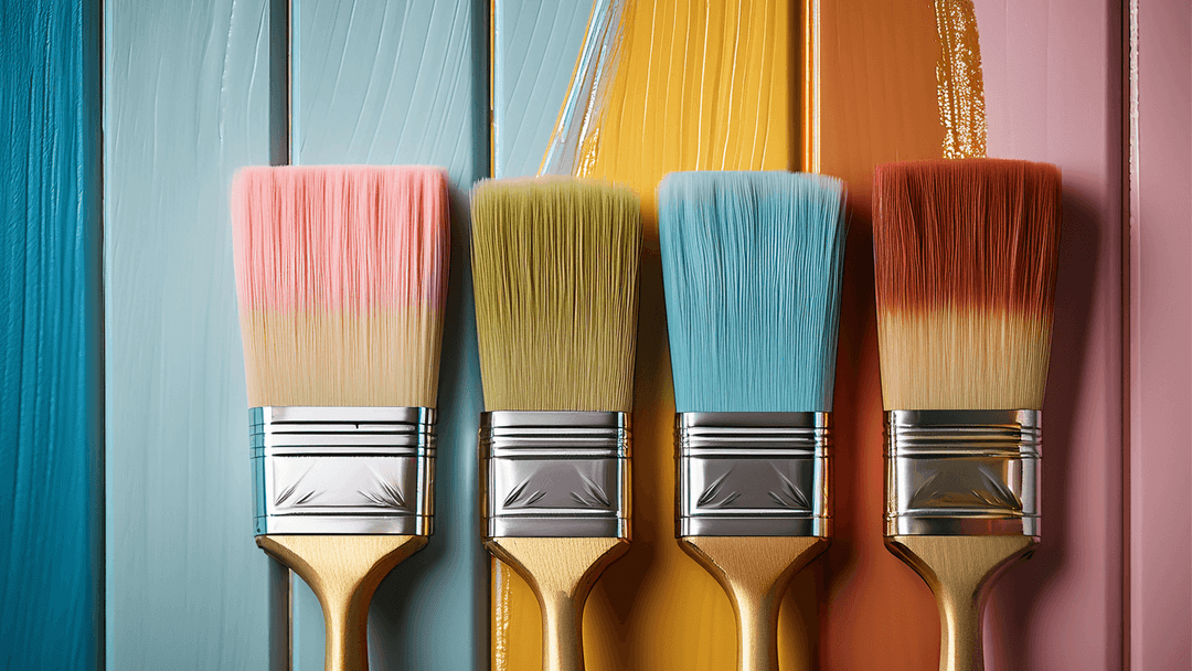
A practical approach is to test samples on at least two walls and observe them morning and evening. Many heritage paint brands now sell sample pots and peel-and-stick swatches, which are ideal for avoiding expensive mistakes.
Finishes: the premium difference
Colour is only part of the story. The finish makes an enormous difference to how paint looks and performs. As a professional painter in Cheltenham, I always recommend matching finishes to the function of the room.
Walls and ceilings
Premium matt finishes (sometimes called estate emulsion) create a velvety, even look that hides minor imperfections and gives walls real depth. In high-traffic rooms, scrubbable matt is a practical upgrade.
Woodwork and doors
Satin and eggshell finishes are ideal for doors, skirting boards and trims. They offer durability without the harsh shine of gloss, making them perfect for period details.
Fireplaces and alcoves
These deserve special treatment. Slightly deeper shades in a durable eggshell finish create a focal point that’s both practical and elegant.
Room-by-room recommendations
Every room has its own needs. Here are some quick suggestions:
- Living rooms: Warm neutrals with a dark feature wall or fireplace surround.
- Bedrooms: Calm sage greens or soft blues, paired with warm whites on ceilings.
- Hallways and stairs: Hardwearing mid-tone neutrals, with staircases highlighted in contrasting woodwork shades.
- Kitchens: Light-reflective neutrals with darker cabinetry for contrast.
Tips from a Cheltenham painter
Over the years, I’ve seen how small choices make a big difference. Here are some lessons learned from working on period homes locally:
- Always sample paints against your specific flooring and furnishings—Cotswold stone floors, for example, change how whites appear.
- Don’t default to brilliant white ceilings—it can feel stark against warmer stone and plaster. Instead, choose an off-white or cream with warmth.
- Pay attention to staircases. Painted well, they become the showpiece of your home rather than a forgotten passageway.
- Invest in quality paints. They apply better, last longer, and age more gracefully than cheap alternatives.
Bringing it all together
Choosing paint colours for a Cheltenham period home is about more than personal taste. It’s about respecting the building’s character, enhancing light, and making sure every detail—from cornices to banisters—works in harmony.
If you’d like professional support, I specialise in premium interior painting across Cheltenham. Whether you’re restoring a Regency terrace or updating a Victorian hallway, I’ll help you choose the right palette and deliver a flawless finish that lasts.
Transform Your Period Home with a Premium Finish
Inspired to refresh your home? I’d love to help. Get in touch today for a personalised quote and discover how the right colours can make your period property shine.
3 comments for "An Interview with John Doe"
That's a really interesting read, thanks. I might try the sage in the bedroom, it sounds lovely.
September 16, 2025 at 1:37 pmYou're most welcome - let me know how you get on.
September 17, 2025 at 11:26 amCan you post photos of how it went Julie?
September 25, 2025 at 12:05 pm